Client Name
Inti Vape

Category
Freelance
Published
2017
Building a Premium Identity for Inti Vape
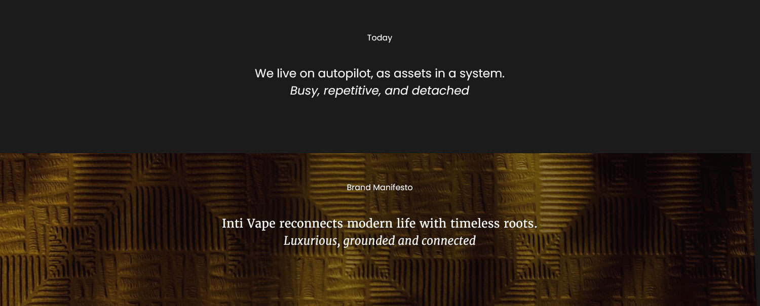
Inti Vape is a vape juice company based in Los Angeles. The name comes from Inti, the Inca Sun God, reflecting the founders’ vision for a brand that feels both sophisticated and luxurious.
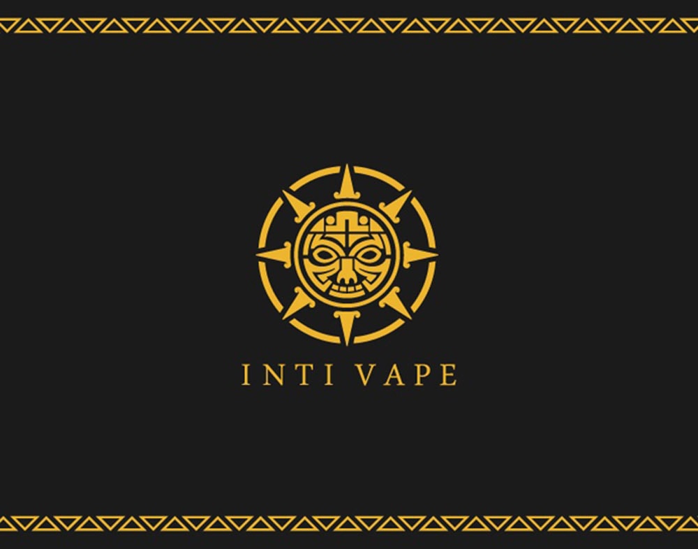
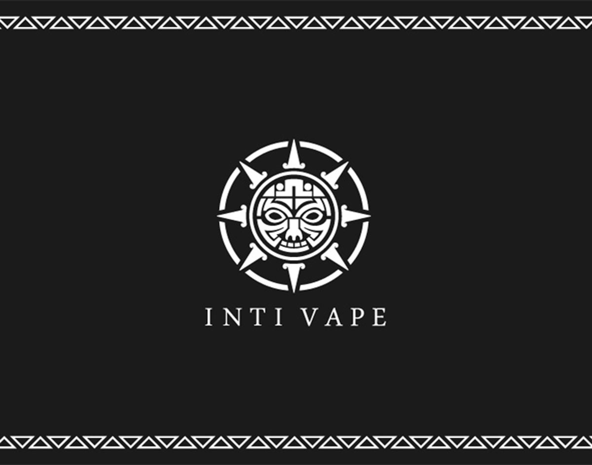
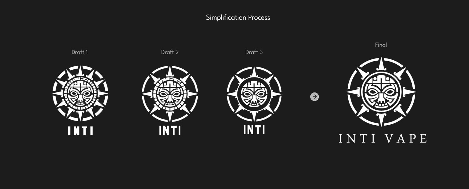
The logo was inspired by traditional illustrations of the Latin American Sun God, incorporating bold facial features and geometric patterns—echoing the artistic style of Native Latin cultures. A gold and black color palette was chosen to emphasize the brand’s premium quality.

Part 0 - Foundation
Brand Identity
Part 1a- Branding
Logo Development
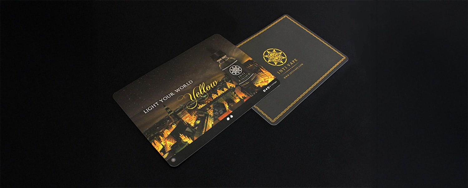
Part 2a- Marketing Asset
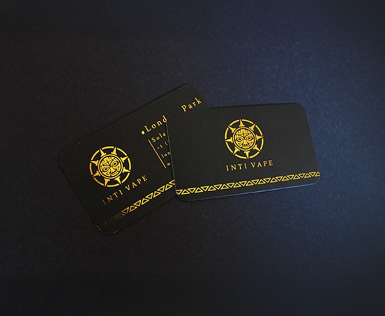
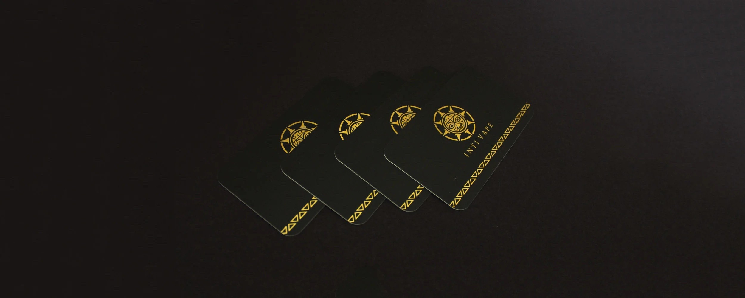
Business Card Design
The typefaces and logos were designed with a gold-leaf gilded finish in mind, adding a sense of elegance and refinement. The business cards were produced using high-quality plastic with rounded corners to align with the brand’s premium identity. Every detail was considered to reflect the company’s luxurious and sophisticated theme.
Part 2b- Marketing Asset
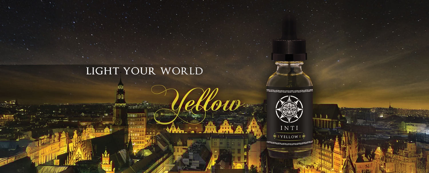
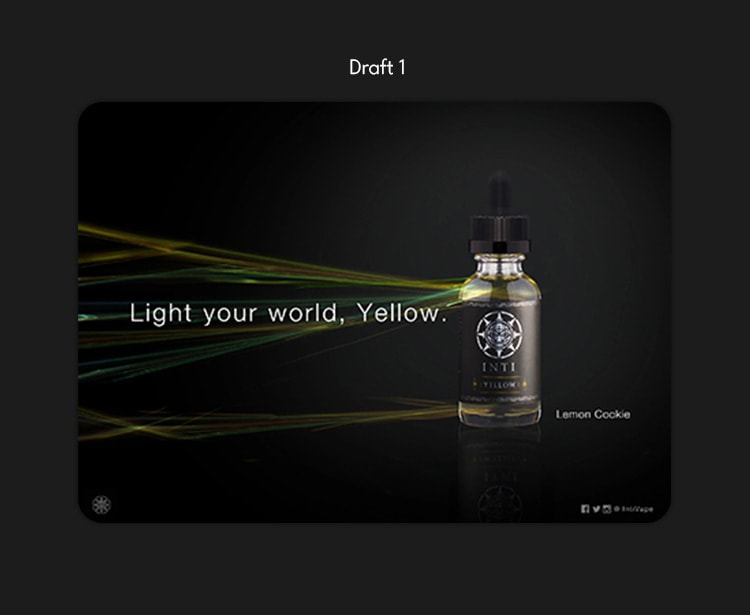
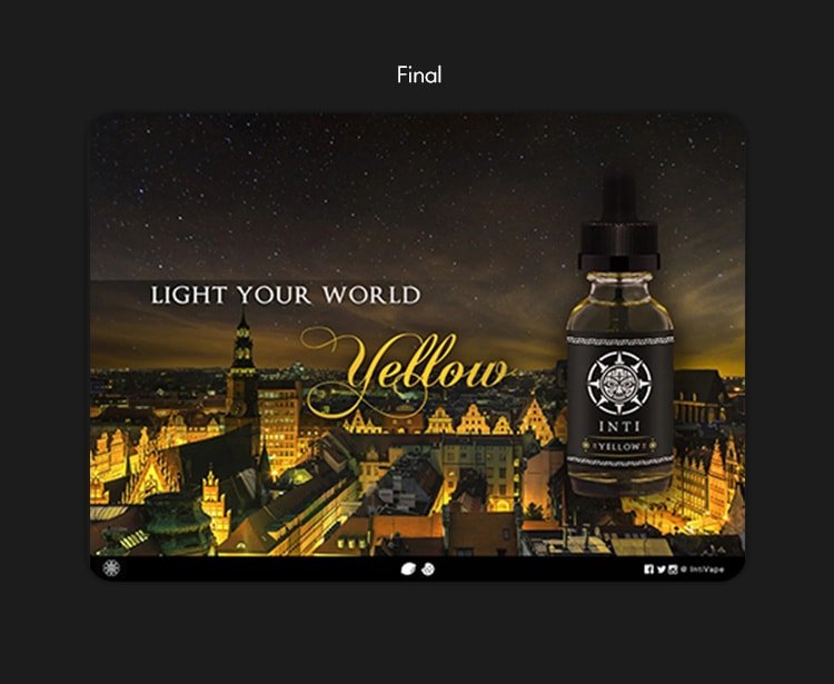
Advertising Banner
For the advertising banners, the initial concept featured an energy aura radiating from the bottle to emphasize intensity. However, to better highlight the premium quality of the product, the final design incorporated a city skyline with lights emanating from the bottle, evoking a sense of luxury and sophistication.
Part 2c- Marketing Asset
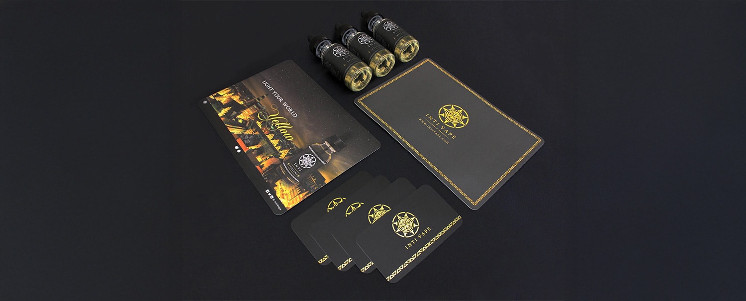
Product Label
The product labels were designed with silver or gold-leaf gilding to reinforce the brand’s premium feel. A consistent layout system was developed so that, when displayed together, the bottles feel like part of a collectible series. In their first year, the company launched two flavors, each available in four different caffeine strengths.

© 2025 Isaac Hong
Client Name
Inti Vape

Category
Freelance
Published
2017
Project Type
Branding, product label, business card
Building a Premium Identity for Inti Vape
Inti Vape is a vape juice company based in Los Angeles. The name comes from Inti, the Inca Sun God, reflecting the founders’ vision for a brand that feels both sophisticated and luxurious.
The logo was inspired by traditional illustrations of the Latin American Sun God, incorporating bold facial features and geometric patterns—echoing the artistic style of Native Latin cultures. A gold and black color palette was chosen to emphasize the brand’s premium quality.

Part 0 - Foundation
Brand Identity
Part 1a- Branding
Logo Development
Part 2a- Marketing Asset
Business Card Design
The typefaces and logos were designed with a gold-leaf gilded finish in mind, adding a sense of elegance and refinement. The business cards were produced using high-quality plastic with rounded corners to align with the brand’s premium identity. Every detail was considered to reflect the company’s luxurious and sophisticated theme.
Part 2b- Marketing Asset
Advertising Banner
For the advertising banners, the initial concept featured an energy aura radiating from the bottle to emphasize intensity. However, to better highlight the premium quality of the product, the final design incorporated a city skyline with lights emanating from the bottle, evoking a sense of luxury and sophistication.
Part 2c- Marketing Asset
Product Label
The product labels were designed with silver or gold-leaf gilding to reinforce the brand’s premium feel. A consistent layout system was developed so that, when displayed together, the bottles feel like part of a collectible series. In their first year, the company launched two flavors, each available in four different caffeine strengths.
© 2025 Isaac Hong